
2021 update: in the time since this blog post was first published in 2019, I've rewritten my blog with Gatsby! That said, I'm keeping this post available for historical purposes.
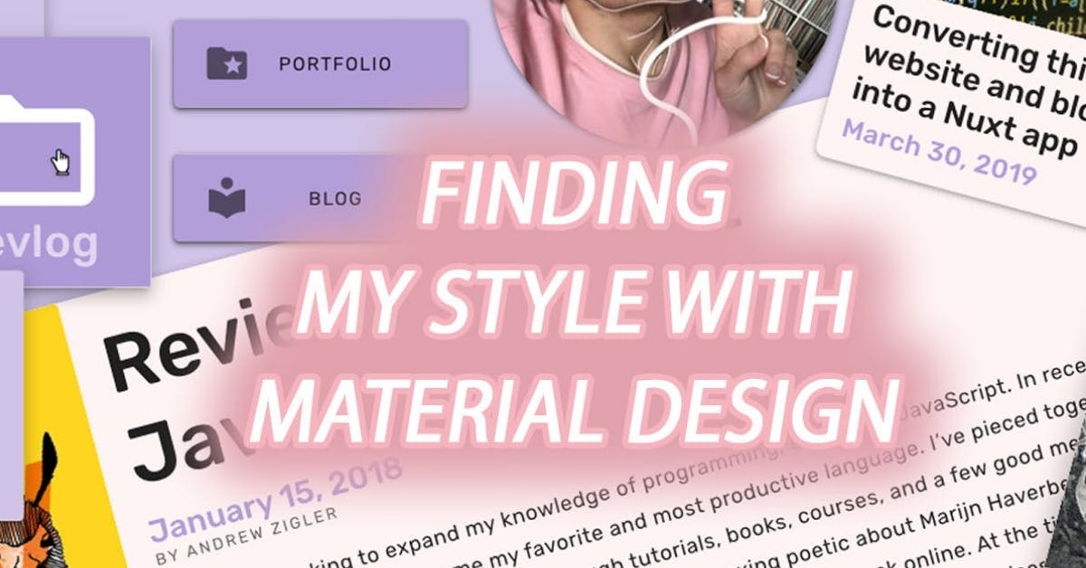
As I continue converting this website into a Nuxt app, I’m encountering design decisions that permeate deep into the style of my actual website. It’s amazing how dramatic the decisions about padding, font, and color can impact the aesthetic and usability of an interface. At this point, I'm more inclined to use an established UI framework that’s been brainstormed and battle-tested into something more polished, as opposed to making something from scratch. As a result, I’ve started learning Material Design as I assemble my website and blog with Vuetify components. 2021 update: I've since learned a lot about styling and this website no longer uses Material Design! I've chosen to make my own styles instead.
Starting out, I spent a great deal of time creating mockups for my website in Sketch with the Material Theme Editor plugin. I adapted my current website color palette into a new medley of pastels and grays that felt more modern when paired with the rounded corners of my new elements. One by one, I assembled the different components I would need in order to render my website on both desktop and mobile. It took some time, but I built mock-ups for every type of view for my website so I would be forced to make design decisions globally, not on the fly. I didn’t want to pigeonhole myself by making a quick decision that could ripple out and tarnish the entire design, so I worked on a canvas before I started writing HTML and CSS.
This approach worked well for me while learning the basics of Material Design, but as I finish this project and embark on my next endeavor, I know future implementations of Vuetify will be faster and cleaner as I continue to develop my own library of components. The power of prototyping in Sketch became evident when I wanted to make impactful changes, as I could globally change the colors, fonts, and other properties in a way that intelligently affects all of the components downstream. The plugin will even vertically re-center text if the new font has a different midline height. The ability to simulate a hot reload in Sketch enabled me to prototype ideas quickly and efficiently, but moving forward I'll likely just work directly in HTML and CSS.
My final challenge now is adapting text styles within the actual blog posts. I was using Markdown before, but now I’m using a rich text editor that actually serializes the content into HTML, and I can customize how that serialization is performed. I already have as much control as I need by styling the component that holds the actual blog post content, but I’ll also use the serializer to tag the generated HTML correctly and make special tweaks when appropriate. This will make the website appear more polished and professional.
In my final blog post of this series, I’ll be exploring the SEO changes I’ve made to the website as part of this conversion.